
To understand an air quality chart, start by noting the pollutant types like ozone, PM2.5, and CO, which indicate pollution sources. Pay attention to the color codes—green means safe, while red or purple signals hazardous levels. Check the numerical AQI values for a clear severity measure, and watch how levels change throughout the day. Weather and seasonal factors also influence pollution, so observing patterns helps you make informed decisions. Keep reading to learn more ways to interpret these charts effectively.
Key Takeaways
- Understand the color coding to quickly grasp air quality levels—green is safe, red or purple indicates hazards.
- Check pollutant types and their levels, focusing on AQI numbers for a clear severity measure.
- Note the timeline to identify daily patterns and pollution spikes throughout the day.
- Familiarize yourself with standards to interpret whether pollutant concentrations are safe or concerning.
- Use weather and seasonal info to anticipate changes and better understand fluctuations in air quality data.
Understanding how to read an air quality chart can help you make informed decisions about your health and outdoor activities. When you see an air quality chart, you’re fundamentally looking at a snapshot of how clean or polluted the air is in your area. These charts often display different pollutants, such as ozone, particulate matter (PM2.5 and PM10), carbon monoxide, sulfur dioxide, and nitrogen dioxide. Recognizing what these pollutants mean and how they relate to air pollution sources can help you better interpret the data. For example, high levels of particulate matter often come from vehicle emissions, industrial processes, or natural events like wildfires. Knowing this makes it easier for you to understand why air quality might be poor on certain days.
Understanding pollutants helps you interpret air quality and protect your health daily.
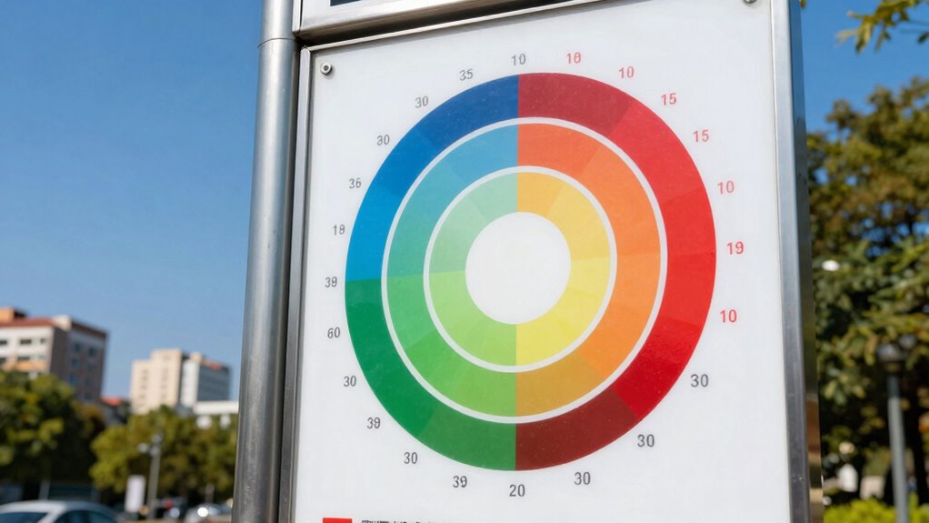
Most air quality charts are designed around air quality standards, which are guidelines set by agencies such as the EPA. These standards define safe levels of pollutants for public health. When you see colors or numerical values on the chart, they typically correspond to these standards, indicating whether the air quality is good, moderate, unhealthy, or hazardous. For instance, a green zone usually signifies air quality within safe limits, while red or purple indicates that the air is unhealthy or hazardous. By understanding these standards, you can quickly assess whether it’s safe to go for a run, walk your dog, or spend time outdoors.
The chart’s numerical readings are also essential. They often follow the Air Quality Index (AQI) scale, which simplifies complex pollutant data into a single number. A lower AQI means cleaner air, while a higher AQI suggests worse pollution levels. For example, an AQI of 50 or below is considered satisfactory, whereas anything above 300 is considered hazardous. When you see these numbers, you can decide whether to limit outdoor activities or take precautions like wearing masks. Additionally, understanding the pollutant sources behind the data can help you identify local activities or conditions contributing to poor air quality. Recognizing how weather influences air quality can also be beneficial, as weather conditions can significantly impact pollution levels throughout the day. For example, seasonal variations can cause fluctuations in pollution, making it important to monitor regularly. Being aware of air quality trends over time can further help you plan outdoor activities around safer days.
It’s important to pay attention to the timeline on the chart as well. Air quality can fluctuate throughout the day due to weather conditions, traffic patterns, and industrial activity. Tracking changes over time helps you understand patterns and anticipate when pollution might spike. By combining knowledge of air pollution sources with air quality standards, you become better equipped to interpret the information on these charts. Ultimately, understanding how to read an air quality chart empowers you to protect your health and plan outdoor activities wisely, especially on days when pollution levels are high.
air quality monitor with AQI display
As an affiliate, we earn on qualifying purchases.
As an affiliate, we earn on qualifying purchases.
Frequently Asked Questions
What Are the Main Pollutants Shown on Air Quality Charts?
The main pollutants shown on air quality charts include particulate matter (PM2.5 and PM10), ground-level ozone, nitrogen dioxide (NO₂), sulfur dioxide (SO₂), and carbon monoxide (CO). These pollutants come from sources like vehicle emissions, industrial processes, and natural events. The chart uses measurement units like micrograms per cubic meter (µg/m³) or parts per million (ppm) to show pollutant levels, helping you understand air safety and pollution severity.
How Often Are Air Quality Updates Provided?
Did you know that air quality updates are typically provided hourly? This frequent reporting helps you stay informed about pollution sources and how they impact air quality standards. Most agencies update charts every hour or two, ensuring you get timely information. By monitoring these updates regularly, you can better understand pollution trends and take precautions when air quality worsens, safeguarding your health and environment effectively.
Can Air Quality Vary Significantly Within a City?
Yes, air quality can vary considerably within a city due to factors like indoor pollution and traffic congestion. High traffic areas often have worse air quality because of vehicle emissions, while indoor pollution from heating or smoking can also lower air quality indoors. You should pay attention to local air quality updates, especially if you’re near busy roads or spending time indoors with potential pollutants, to stay safe.
What Health Risks Are Associated With Poor Air Quality?
Poor air quality can hit you like a storm, increasing your risk of indoor pollution and respiratory issues. Breathing in contaminated air can cause coughing, wheezing, and even worsen asthma or bronchitis. Long-term exposure may lead to chronic respiratory problems or heart disease. Protect yourself by checking air quality levels regularly, especially during high pollution days, and reduce outdoor activity to keep your lungs safe from harmful pollutants.
How Do Weather Conditions Affect Air Quality Readings?
Weather conditions greatly influence air quality readings through meteorological factors like wind, temperature, and humidity. Strong winds help disperse pollutants, lowering their concentrations and improving air quality. Conversely, high temperatures can trap pollutants near the ground, worsening conditions. Humidity can cause particles to settle or form smog, while stable weather patterns reduce pollutant dispersion. Understanding these meteorological factors helps you interpret air quality readings accurately, recognizing how weather impacts pollution levels.
personal air quality detector
As an affiliate, we earn on qualifying purchases.
As an affiliate, we earn on qualifying purchases.
Conclusion
Now that you know how to interpret an air quality chart, you’re better equipped to protect yourself. Think of the chart as your personal weather forecast, but for pollution—just as you check the weather before heading out, understanding air quality helps you decide when to stay indoors or take precautions. With this knowledge, you can navigate the air around you confidently, turning complex data into a simple tool for healthier living.
portable air pollution sensor
As an affiliate, we earn on qualifying purchases.
As an affiliate, we earn on qualifying purchases.
indoor air quality testing kit
As an affiliate, we earn on qualifying purchases.
As an affiliate, we earn on qualifying purchases.